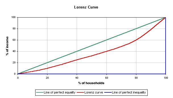
The Lorenz curve is used to show the probability distribution of wealth. In this particular example the Lorenz curve is the red line, the blue line is the line of perfect inequality and the green line is the line of perfect equality.
A scatterplot is a visualization type that compares two or more different variables by plotting dots with an x and y value. This scatterplot is from HTTP://CNX.ORG/CONTENT/M10950/LATEST/AGE_SCATTERPLOT.GIF shows the relationship between husbands and wives and their ages.
A population profile is a graph that shows the population of people as a function of their ages. This population profile from http://www.ifad.org/operations/regional/pf/figure1.gif shows the projected population of Botswana and the projected amount of people and their ages who will have AIDS.
Climographs depict the monthly temperature and precipitation of an area. The bars represent the precipitation and the lines represent the temperature. In this graph from http://www.uwsp.edu/geo/faculty/ritter/glossary/A_D/climograph.html the preciption reaches it's highest point during the coldest months (December, January, and February).
Windrose maps are used to give a view of just how wind speed and direction are mapped at a certain location. This image is a windrose plot for the LaGuardia Airport of New York, New York. It shows that wind blowing south is the strongest. The image is from http://en.wikipedia.org/wiki/File:Wind_rose_plot.jpg
Triangular plots are graphs of three variables. The plotted points always equal some constant value, for example three points that always come out to a hundred percent. In this example, found at http://www.dplot.com/triangle_plot.htm, the three variables are soil types (silt, clay, and sand). The graph shows what percentage of each element is found in the soil. This type of information can be useful in an archaeological or architectural context.